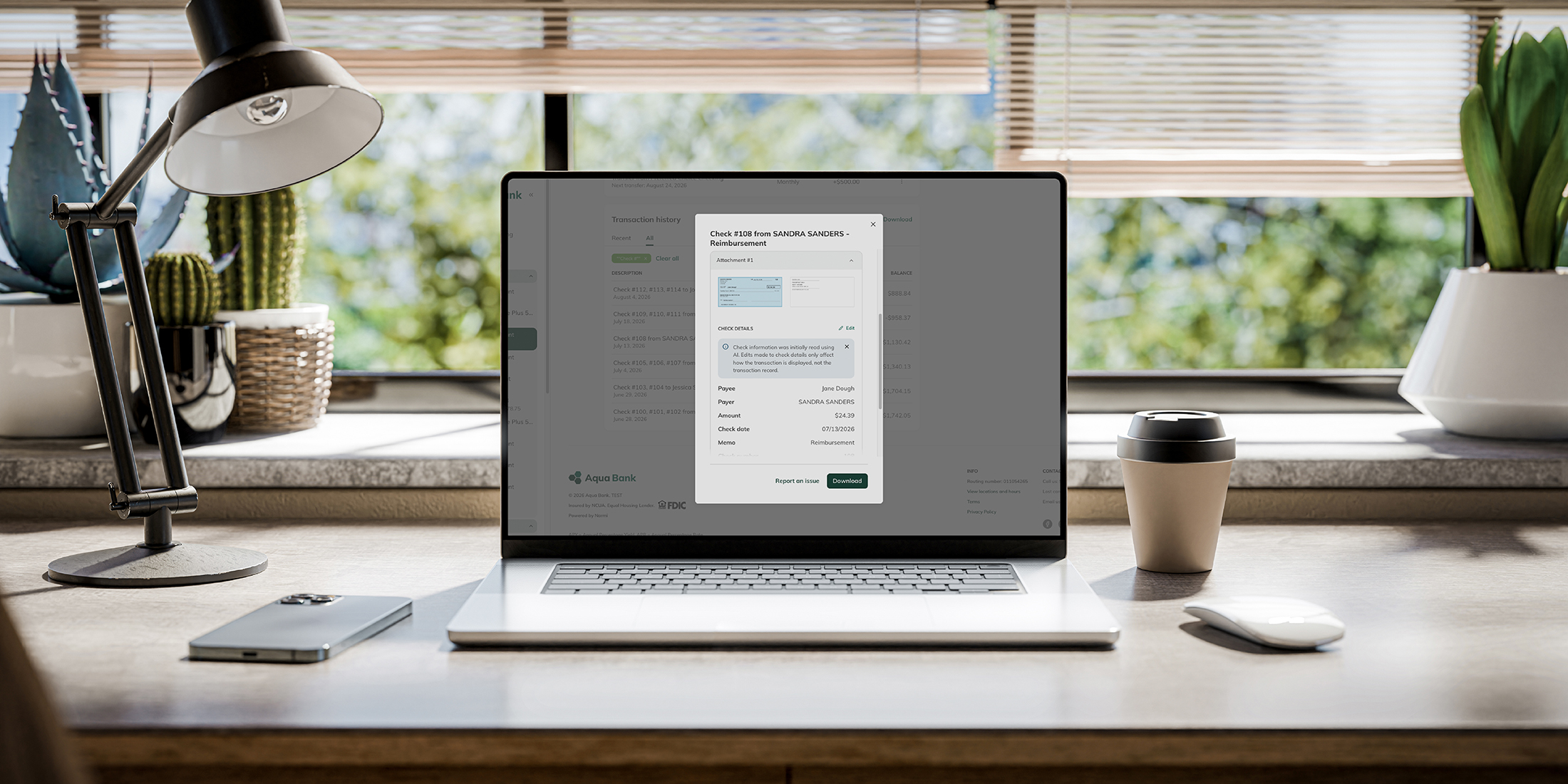

For a user with low vision, a strained, hard-to-read banking experience isn't a minor annoyance, it's a real barrier to banking independently. According to the American Foundation for the Blind’s most recent survey, nearly 1 in 5 American adults, 49.5 million people, report some difficulty seeing, even with glasses on. Yet a recent report on web accessibility by WebAIM suggests that low contrast text remains the single most common accessibility failure on the web today, found on nearly 84% of home pages. Narmi's new High Contrast Mode is built to ensure that's never the case, sharpening the contrast between text, buttons, and backgrounds so accountholders can read what’s in front of them.
Digital banking is no longer a convenient alternative to the branch. For many users and accountholders, especially those with visual impairments or aging eyesight, it's the primary way they manage their finances. For those accountholders, whether the interface is actually readable isn't a minor detail, it's the key to financial autonomy.
High Contrast Mode also strengthens your institution's Web Content Accessibility Guidelines (WCAG) compliance. The WCAG define an accessible website as one that's perceivable, operable, understandable, and robust, criteria that exist because a site can't actually serve accountholders if they can't see, navigate, or understand it.
Narmi built High Contrast Mode to do both: make banking easier for the accountholders who need it, and give institutions a stronger compliance story to stand behind.
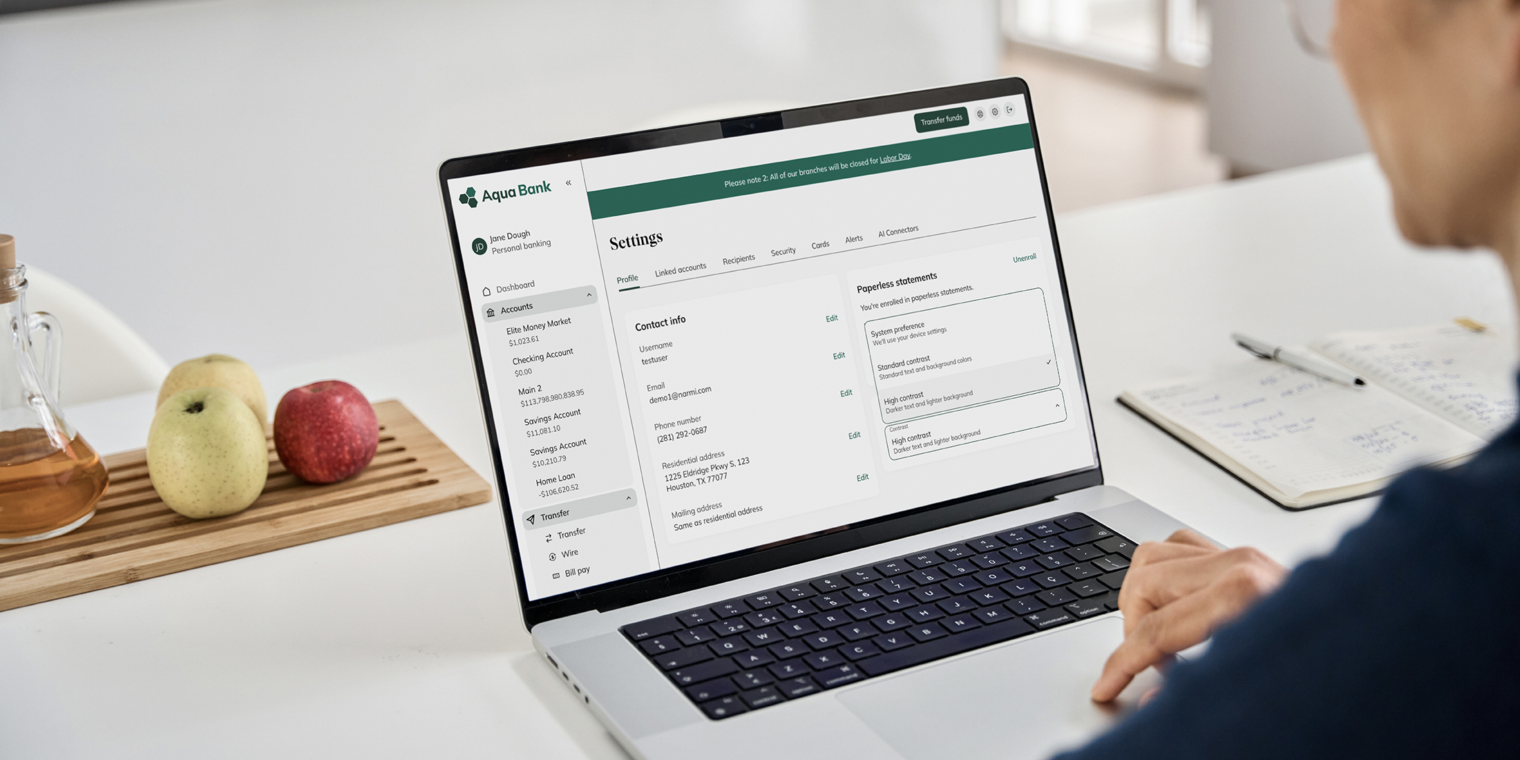
High Contrast Mode is now available in Narmi Banking, Narmi Grow, and Lend. Set to System preference by default, it automatically honors the OS-level "prefers-contrast: more" signal, so anyone who's already turned on high contrast at the device level sees that preference carry over the moment they open Narmi, no extra step required.
When enabled, the interface maximizes the contrast ratio between foreground and background colors, following WCAG contrast ratio guidelines. Borders darken, grey buttons on white backgrounds shift closer to black, and transaction lines that don't always darken in standard mode become clearly visible, making it easier for users with visual impairments to read balances and complete transactions with far less strain.
This feature exists for one simple reason: digital banking should work for everyone, and your institution should be able to stand behind that. High Contrast Mode is live now across Narmi Banking, Narmi Grow, and Lend, with no action needed on your end to turn it on. Reach out to your Narmi contact if you'd like to learn more about this feature and the upcoming accessibility features Narmi's working on.